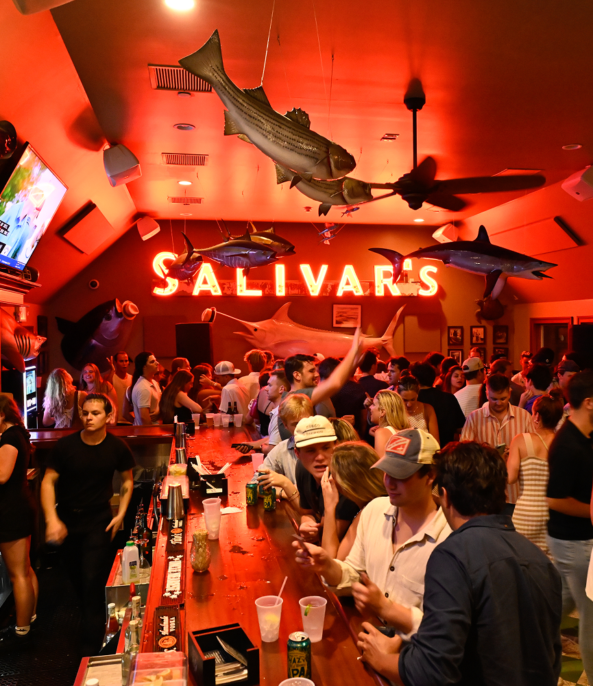
breathing life into a montauk institution
OBJECTIVE
refresh the identity & embrace the history for a restaurant adored by locals and vacationers alike.VISUAL IDENTITY
PRINT DESIGN
WEBSITE
brand strategy
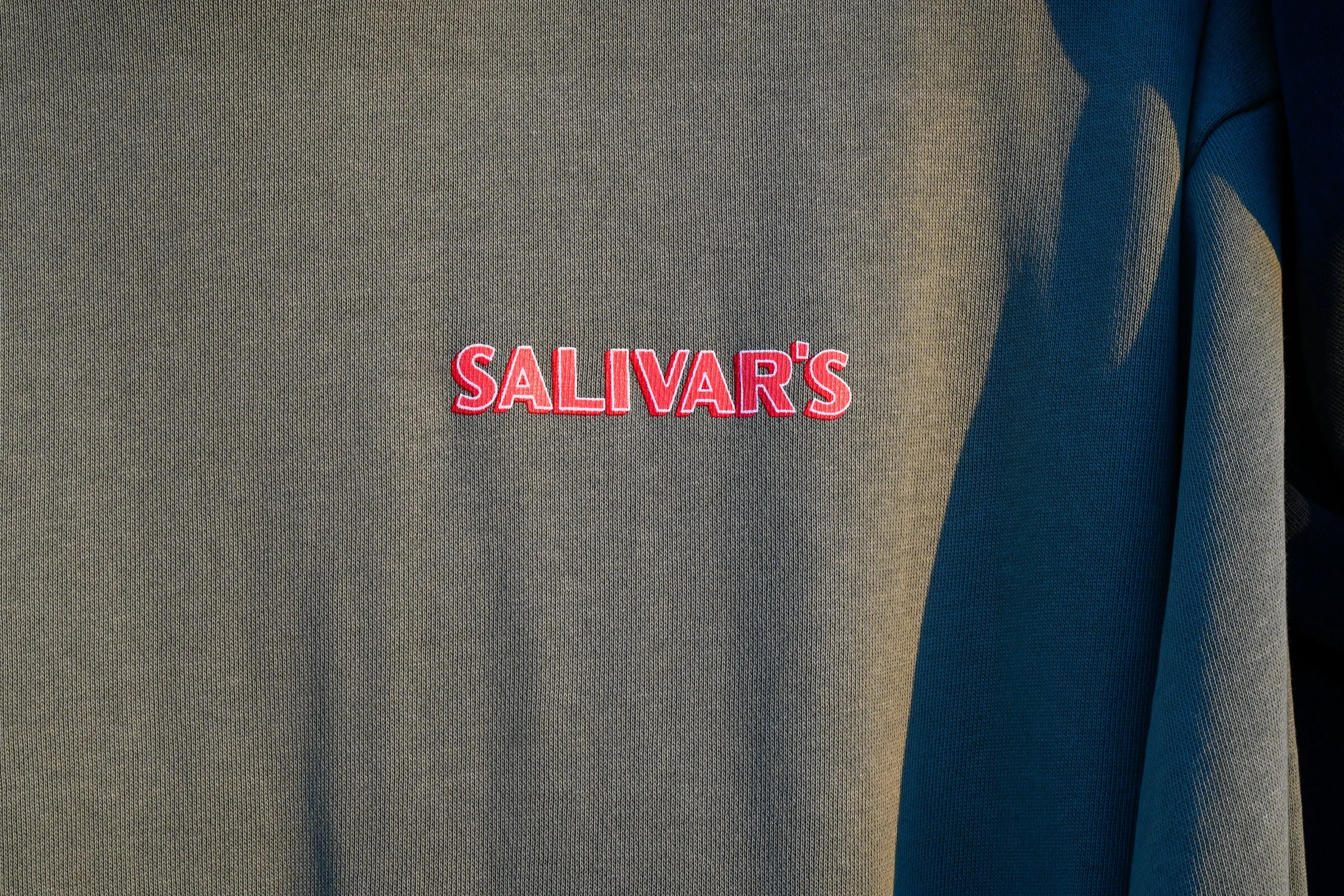
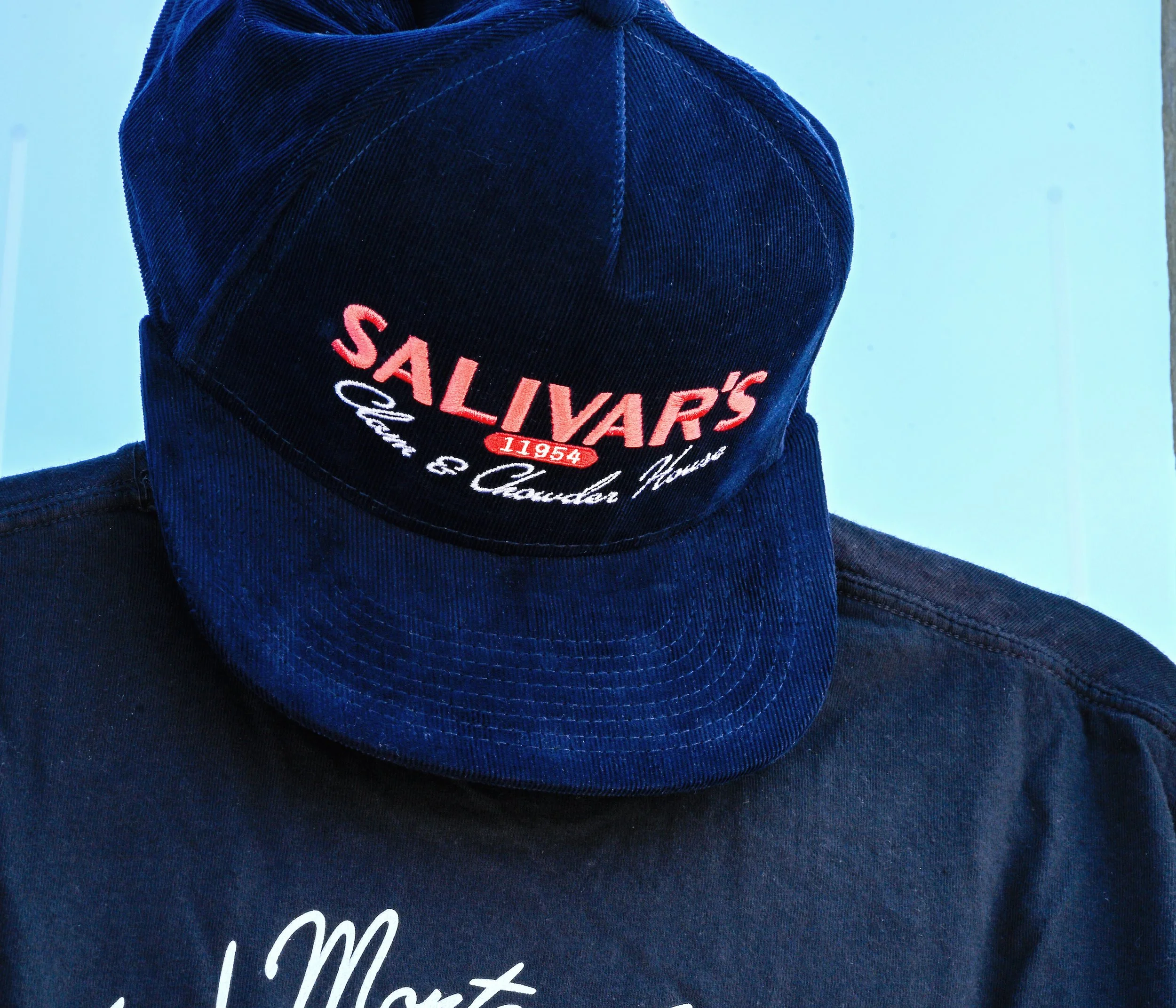
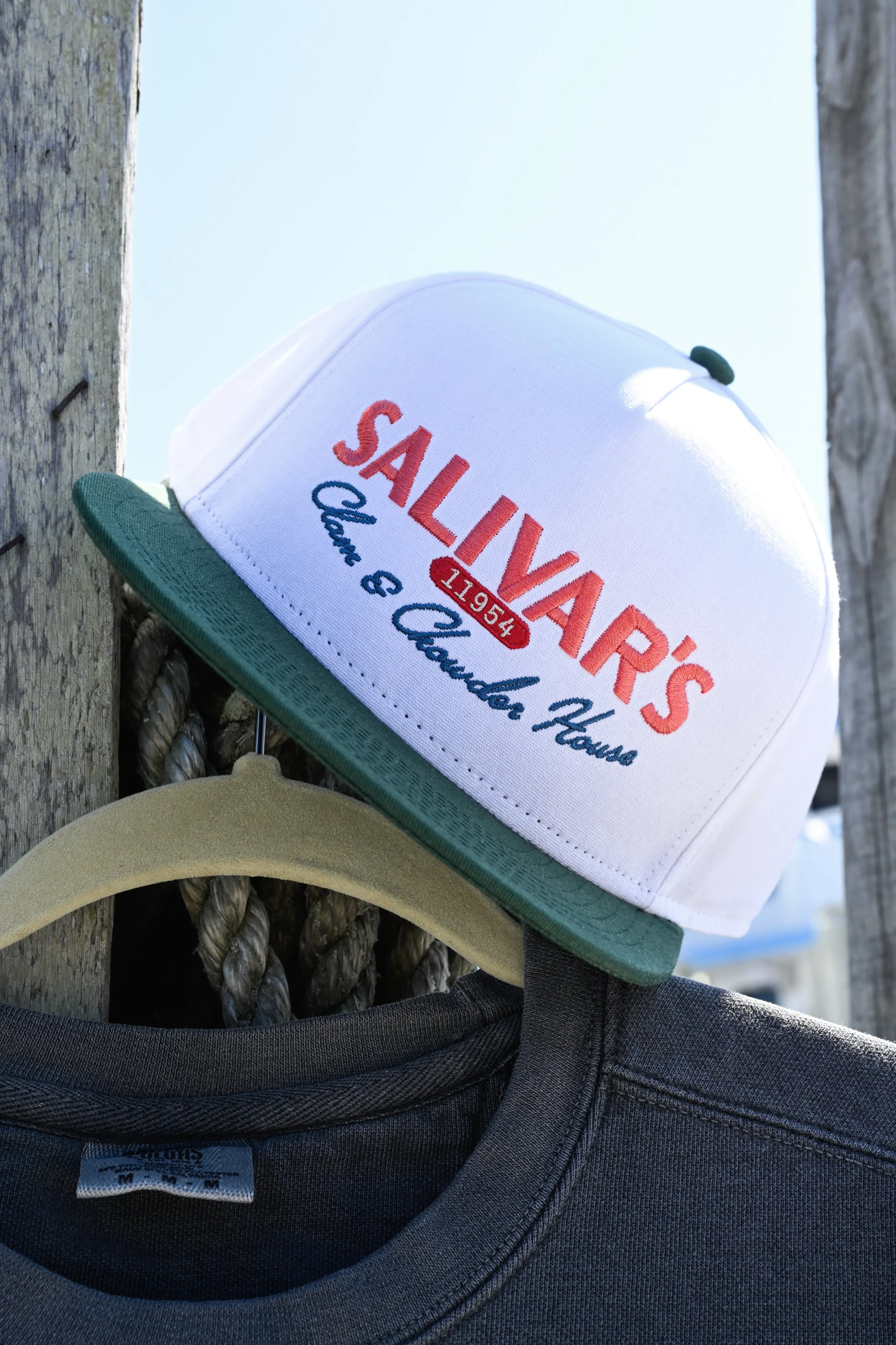
custom typography
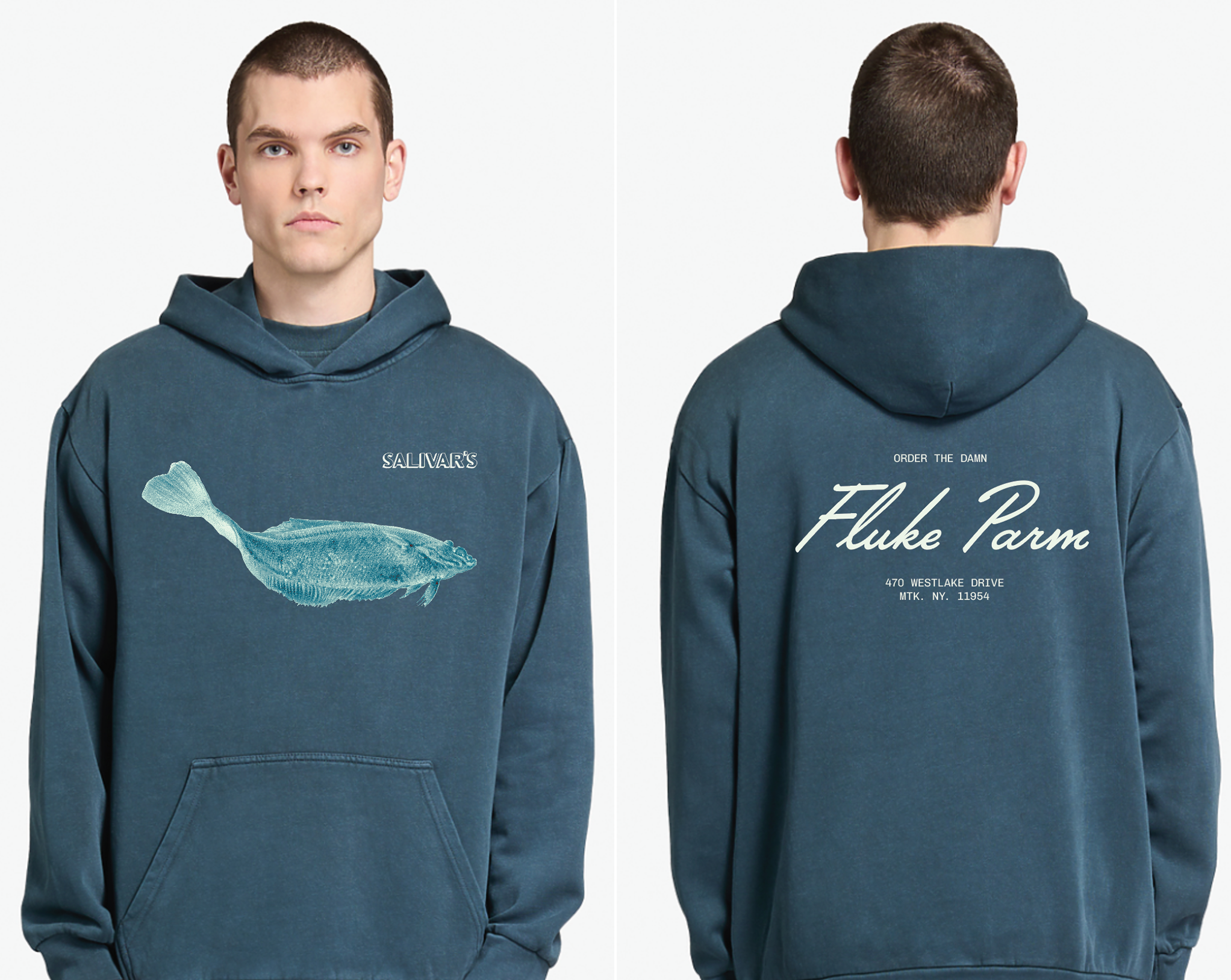
PHOTOGRAPHY by RYAN SHERMAN
SOLO PROJECT
ALL CREATIVE & DESIGN by myself unless otherwise noted
whether it’s a friend’s night out or a family dinner, nostalgia can be found in every corner, the backdrop to make memories.

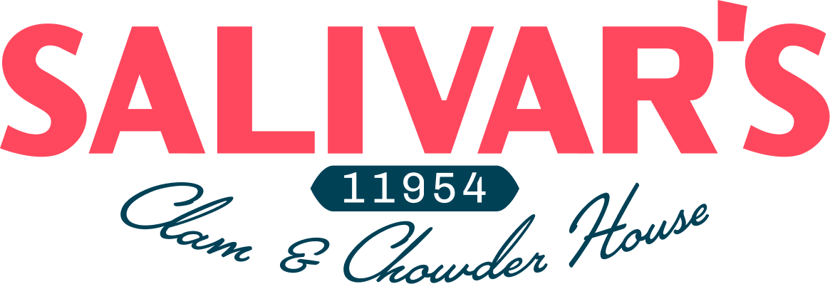
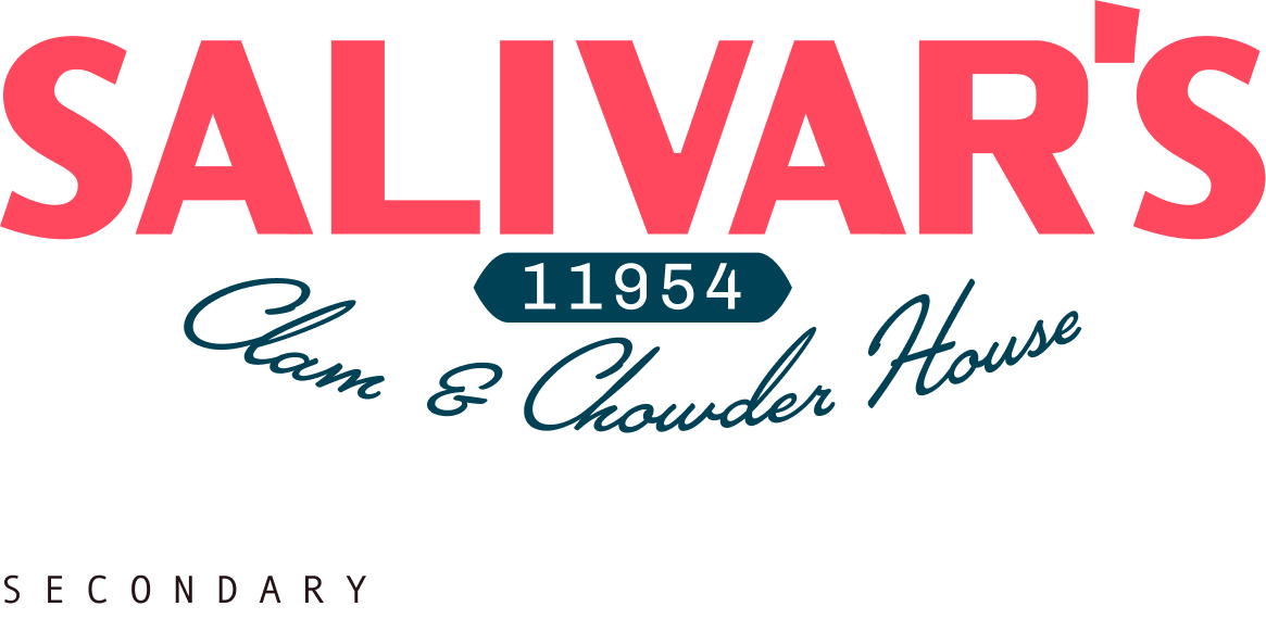
CUSTOM type
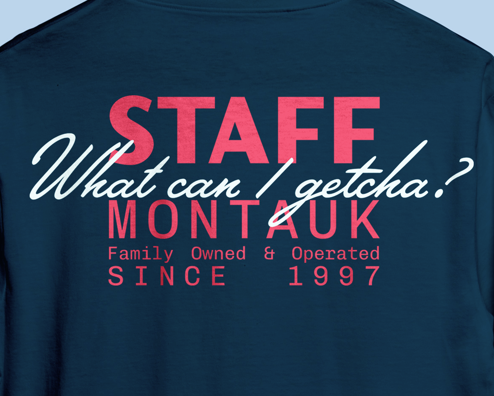
the logo type was hand drawn referencing the iconic grand-fathered in neon sign.
the wordmark was designed to transition from the family-friendly classic restaurant to the nightlife hub of the docks going from the solid structure of the sign a verison of the stylized neon tubes.


Stationery
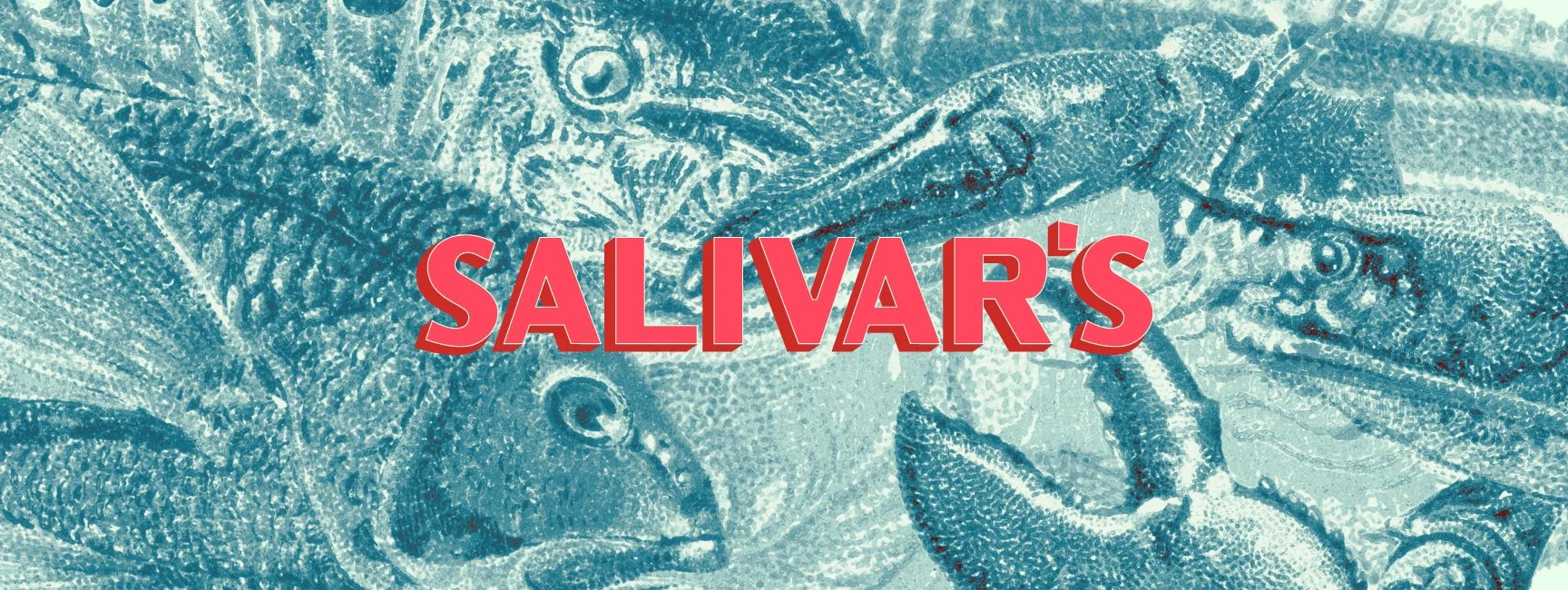
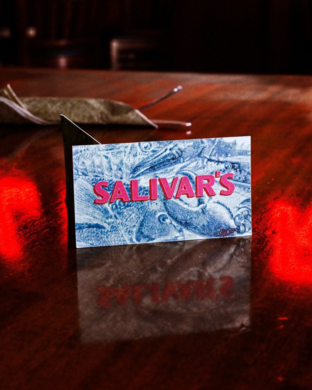
"local catch" pattern business card
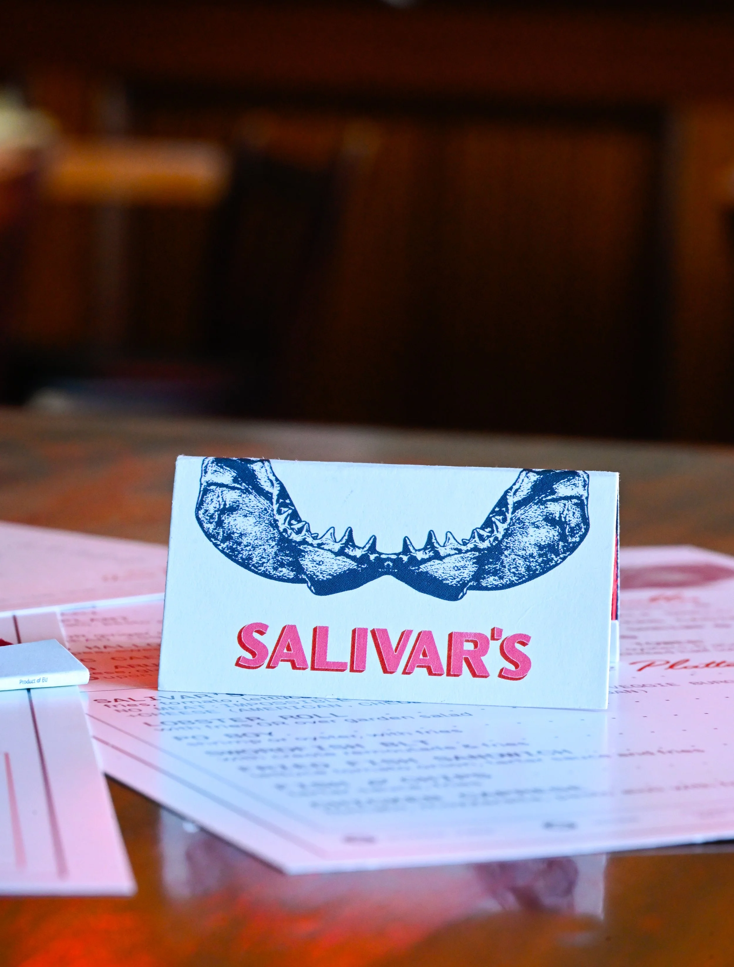
matchbooks [printed by the match group]
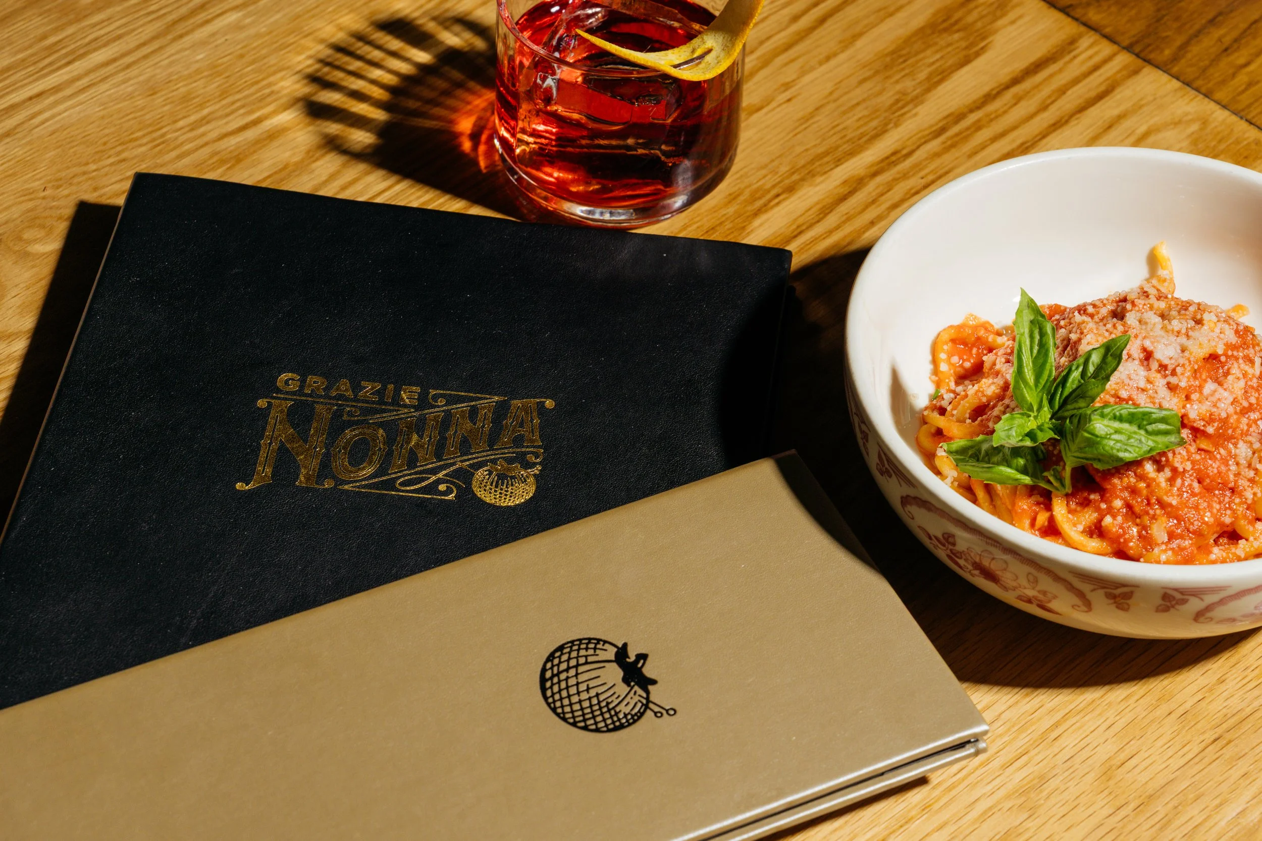
waterproof menu system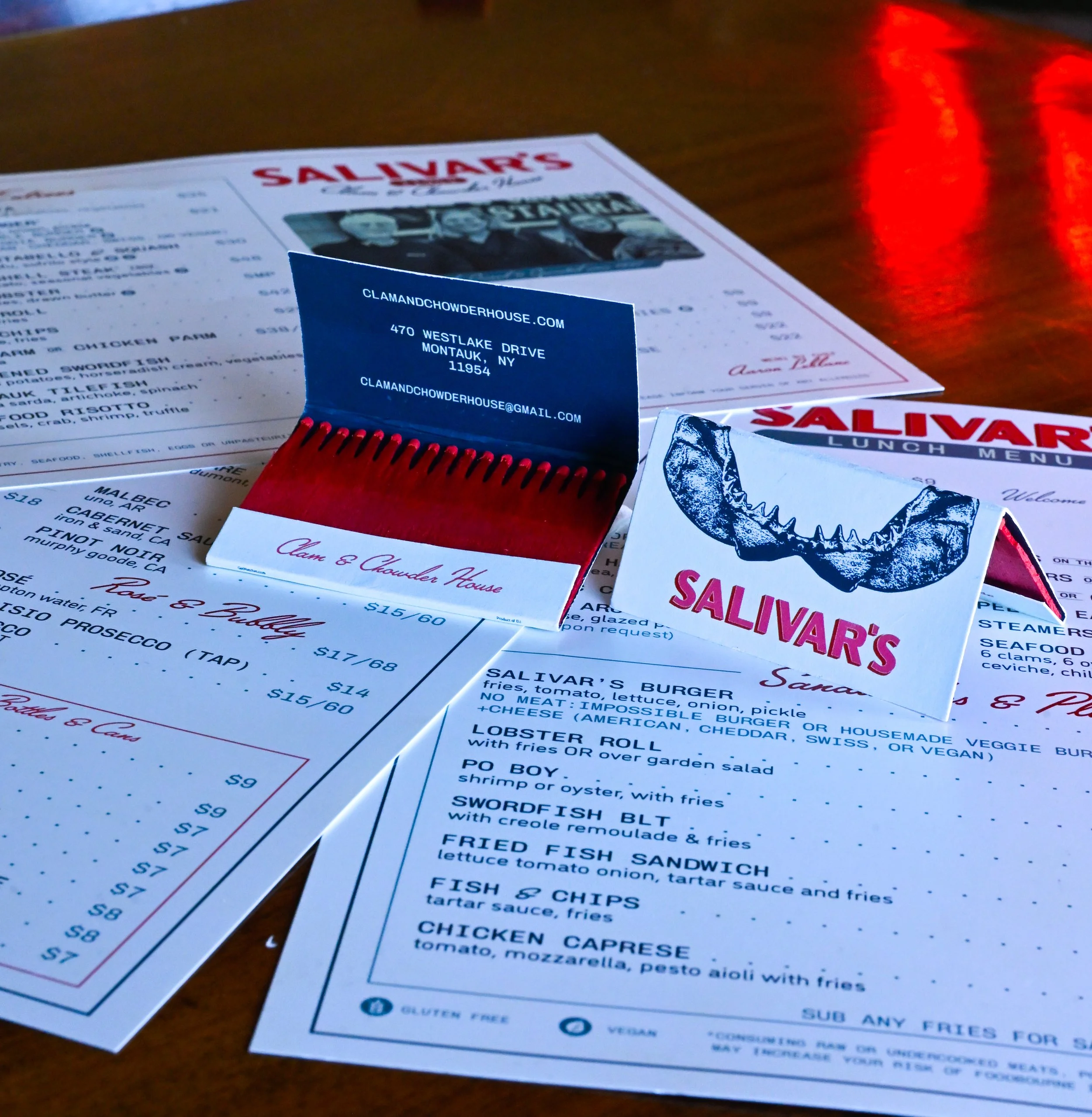


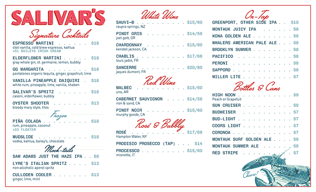

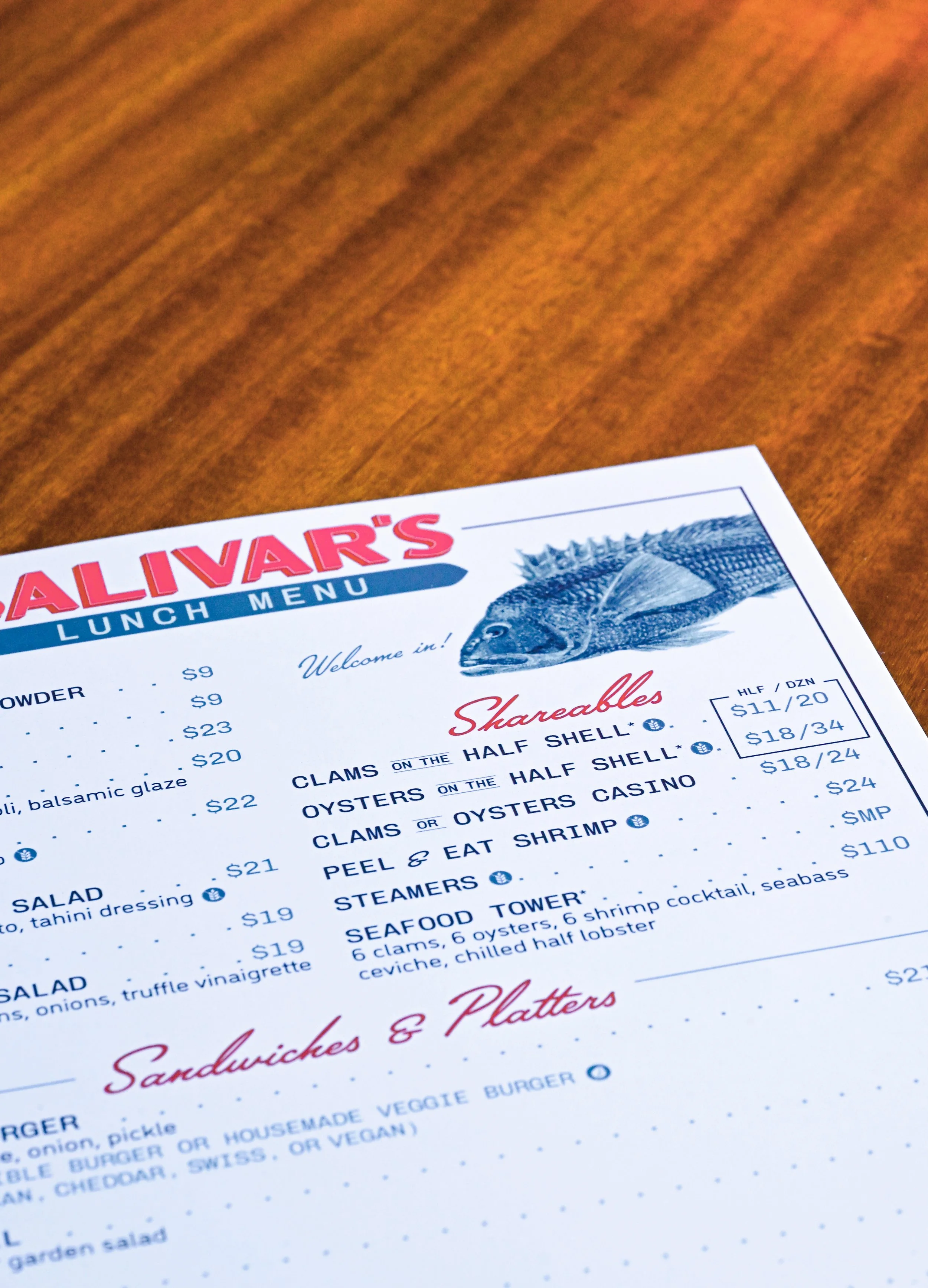
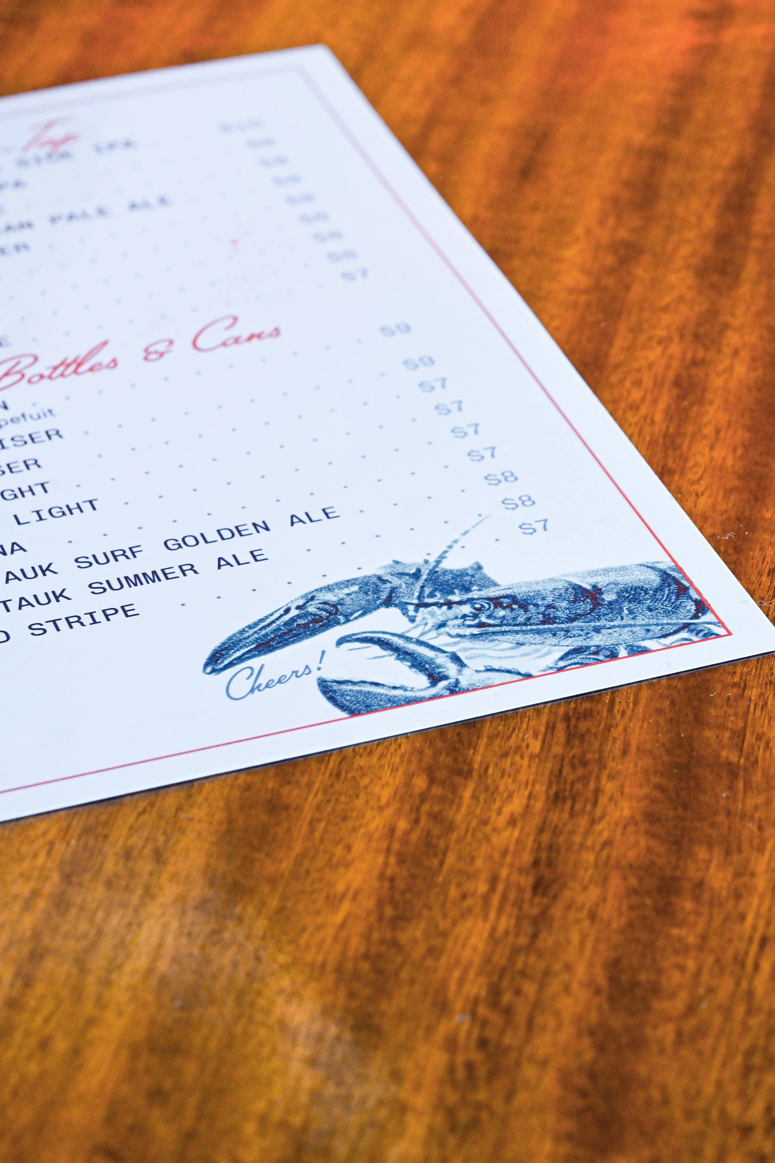
Menu system
printed on waterproof stone paper, layered sizes and local catch welcome you in to enjoy a meal with friends.